Matthew Goh Seng Jun: Nokia Website
Project Description
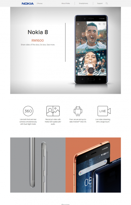
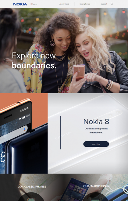
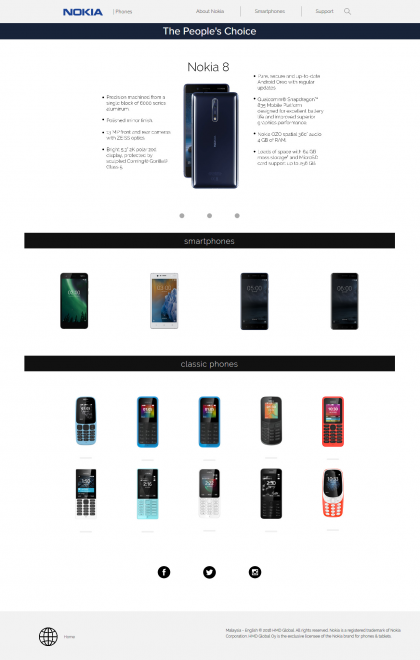
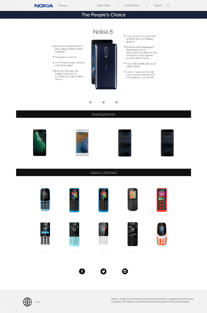
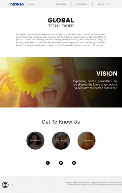
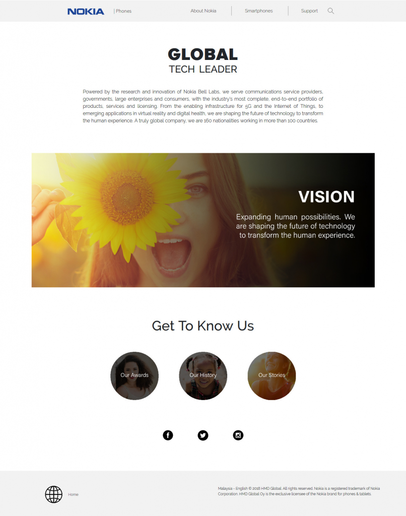
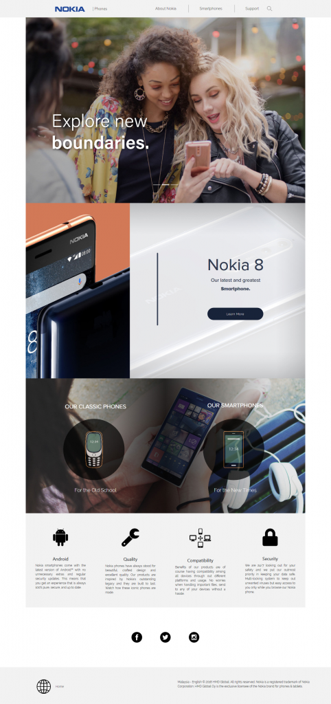
To create an original style for Nokia and follow the target audience that has been set by Nokia themselves that caters towards the market of business men that are older which is around middle age. In this design, its UI suits a little towards a younger audience in order to expand Nokia’s market range as well as pulling in their original target audience with the ease of UI/UX. Slickness and clear flow will be the main core as well as white, grey, black colour scheme conveys simplicity with the touch of Nokia’s signature blue. Other than that, having more faces and negative spaces introduces an inviting vibe not only for users to feel welcome but that users themselves don’t get overwhelm by having too much to see on screen all the time. Connecting and experience is key in websites and being able to communicate well with its UI and understand the user flow of the page is what subconsciously goes through people’s mind without giving a thought. This is the new Nokia site rebranded.
Student Name
Matthew Goh Seng Jun
Batch
MM1605-1
Course Name
Web Design for Communication 2
Semester
Jan-Apr 2018
Lecturer Name
Nicholas Tay
Archive Location
\192.168.1.6MM DeptSHOWCASE20181_DIP_WEBNokia (Matthew)